
Red in Motion
February arrived with a full calendar. With Valentine’s Day and the Lunar New Year converging, I found myself drawn to a few vibrant, blooming peonies—one of the most evocative ways to introduce color into a space.
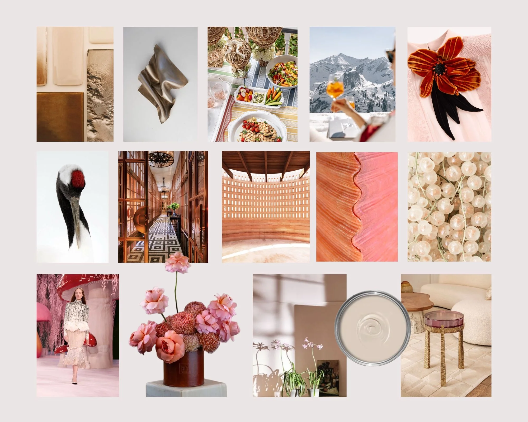
When I think of “Red,” it is never just about heat. To me, it is a fluid vitality on the palette: it can be a spirited pink, a restrained mahogany, or even a neutral with the subtlest rosy undertone.
This February also belongs to the Milano Cortina Winter Olympics. Watching those powerful women on the world stage reminds me of this specific red—a beauty that is both a full bloom and a quiet resilience.
In a room, this becomes a fascinating dialogue. I imagine large surfaces of neutrals with pinkish subtone, paired with the earthy warmth of terracotta, the hand-forged depth of antique bronze, and the rich grain of walnut. Through the delicate calibration of saturation, undertone, and texture, these elements settle into a balance full of tension.
Living within this palette, the shifting sunlight feels warmer, as if the space itself has absorbed that upward energy from the arena. During the holidays, a few fresh blossoms or a curated cushion are all it takes—this flow of color is the ultimate adornment for our emotions.